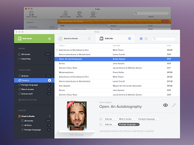
Scida - Flat?
A lot of things happening right now with Scida
. We are working on a couple of new features and on a bunch of interface tweakings.
But it's always a hard task for a designer to lay down and wait for the new release. We've started Scida to make that the iTunes for ebooks. We tweaked the interface a lot, we put a lot of things into it and I think we did a great job. But now I feel it's ready for a big facelift, to reorganize the app and reorganize the features what are in the pipeline.
So I've spent a couple of hours at night to make it cleaner. The goal was easy, highlight the funcionality and delete all the self-serving graphic elements. Should we call it flat? I really hate to categorize the styles like that, especially at an interface... I should describe that design approach as a functionallity focused way.
You like it? Buy our app so that we can afford tweaking the user interface :)
http://getscida.com


