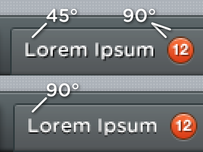
45 vs 90
Some people pointed out that the lighting was not consistent in the previous shot.
I must confess that although in most cases I use 90° (vertical) lighting, for text I prefer 45° (a.k.a. 135° in Photoshop). The reason is that with a 45° drop-shadow (example 1), text is more contrasted and readable.
It's true I'm breaking realism, but I feel like it's for a worthy cause.
Thoughts?
More by Sacha Greif View profile
Like

