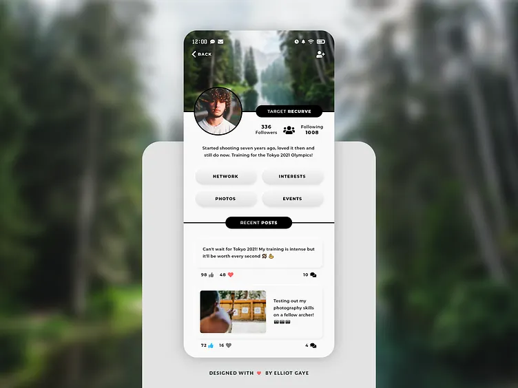
DailyUI #006 - User Profile
Nǐ hǎo Dribbblers 👋
This is my #006 #DailyUI design.
Design Hint 💻 - Design a user profile and be mindful of the most important data, names, imagery, placement, etc. Is it for a serious profile? A social profile?
The Idea 💡 - The idea for today’s UI design is a user profile for the theoretical Archery Community app for Android and iOS I came up with for my very first #DailyUI. The design will feel modern, clean and minimalistic with some neumorphic elements throughout and a clean colour palette.
Final Thoughts 🧠 - I'm really happy with the results! I really like the neumorphic buttons near the middle of the screen and how I've designed the whole interface so that users can see the "recent posts" another user has made, quickly and easily with just a glance. To me, every element is easily noticeable and acknowledgeable of to what said elements do, whether it is text or just icons. So, overall I think this design is both visually pleasing and user friendly and I've had a great time designing it.
Unsplash photo credits 📷 - @lucabravo @vincefleming @ilmino
Hope you like, press "L" if you ❤️ my work!
As always, I welcome any feedback! 😄
Lastly, share the love by pressing the share button if you really like what you see! 👍
- Elliot
