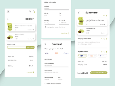
Daily UI: Day 2 Checkout Page
Starting with laying out the most important information, I kept a general note of how I wanted the flow to be like. Making sure the user can always see the right prices and the total was very important, it kept things transparent.
And finishing with colour coordinated buttons and items, it pulled the design together
More by Jade Chau View profile
Like
