And Scene - Layout explorations, Part II
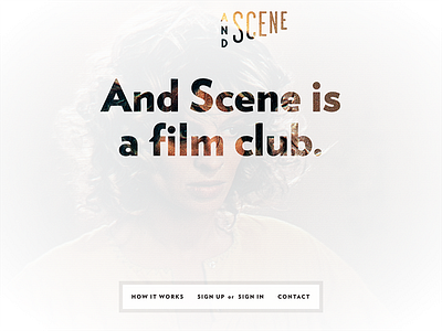
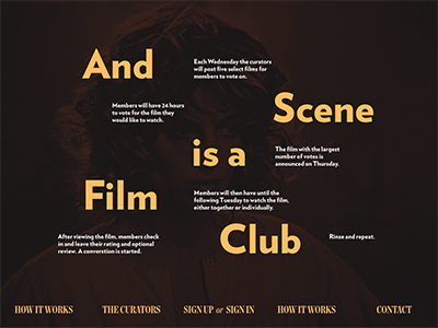
Changing gears a bit for a lighter look. Sticking with my trusty old tricks: beautiful GIANT text and background images that fill the viewport.
Having a blast with the logo @Keith Davis Young created for me. So far works in every application I've tried and feels unique. LOVE it!
In this version of the layout I'm using the logo (an SVG) and the webfonts as a knockout to let the background image peek through the semi-transparent white background color. The background image is random (choosing from a pool of about 50). It almost feels like a foggy glass that you wrote on with your finger. Because, you know, sexy things are happening inside And Scene. Won't you come in?
More by Brandon Durham View profile
Like

