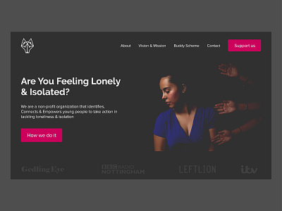
The Wolfpack Project | Non Profit/Charity homepage Redesign
I really love non-profits and I came across this awesome project's website 'Wolfpack Project- https://thewolfpackproject.org.uk.' I felt I could change a few things to drive more leads and did a small Redesign of their Hero section.
1. I worked on hierarchy (Both by changing the layout and the size of the headline on the hero section). I wanted something to shout 'HEY, START HERE!' and that's exactly what the headline 'Are you feeling lonely & Isolated?' does. It immediately directs the user to the most important part...captures attention. The next thing is the image ..intriguing.
2. Added the logos of the media companies on the hero section and not at the bottom (where they were originally placed) or after the hero section (where most people place them) to show credibility.
Tools- Adobe XD
Illustrator.
----
Contact me for full app design or collaboration.
I also do Social Media Strategy for startups and Charity Organizations. Send me a message for a quick chat ☺ Email: aronmtunji@gmail.com, Instagram: https://www.instagram.com/aronmtunji, Twitter: https://www.Twitter.com/aronmtunji
