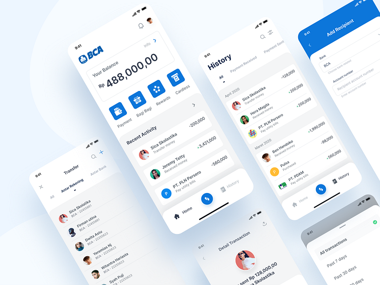
BCA Mobile App
Hi
Last week I was challenged to redesign an app. Then I chose the Mobile Banking application from BCA. Despite the usage, I feel that the design of the application needs to be improved. People won't realize the design unless they start to use other mobile banking applications, they can realize it. I started using BCA Mobile 5 years ago when I studied at High School, but there is no big difference in the design. This is different from any other mobile banking applications which have been using minimalist design.
How do you think? In the next shot I would share the prototype looks like. Stay tuned!
----
We’are available to build your awesome product : hellow.std@gmail.com
Let’s work together! Get in touch and let’s create something awesome.
----
Follow us UI8 | Instagram
Cheers
