Data Visualisation for Annual Research Journal

Making Research Accessible - Visualising Complex Data
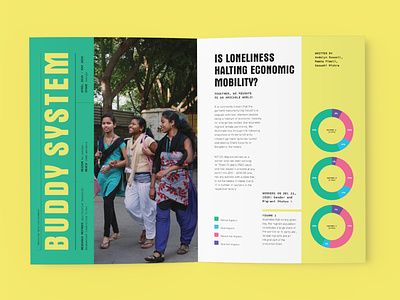
Being a coming of age journal that was as data-heavy as it was emotive, we worked extensively with the researchers at Good Business Lab to create infographics that were accurate, appealing and easy to understand. Using a structured grid, we experimented with the layouts, typography and colours to make data more accessible.
Read more on the process of designing the Magazine here: www.smarterthanawaffle.com/goodbusinesslab/