DailyUI #005 - Icon
Hola Dribbblers 👋
This is my #005 #DailyUI design.
Design Hint 💻 - Design an app icon. What best represents the brand or product? Or is it incredibly unique? Does it look great at a distance and does it stand out when put on your home screen alongside other apps?
The Idea 💡 - The idea for today’s UI design is a minimalistic mobile icon for Android/iOS for the theoretical archery community app I had designed a signup screen for a few days ago, here's the link for that - https://dribbble.com/shots/11941967-DailyUI-001-Sign-Up. The design will feature a similar but more redefined colour palette than the signup UI. I will also be testing out the famous Golden Ratio for the first time, so hopefully all goes well.
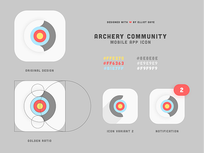
Final Thoughts 🧠 - It's gone great, much better than I expected! I finally found out how to use the Golden Ratio properly for use in icon/logo design. The original design (shown top left) displays an "archery target" with the vibrant colours; this would indicate the "Archery" part of Archery Community. Then there is the letter "C" created from the Golden Ratio in the colour White to finish the "target"; this would indicate the "Community" part of Archery Community. After the original design, I had tweaked it a bit to create a second variant (shown bottom middle) and added in a notification dot, to show of what that would look like (shown bottom right). Overall, it's been an educative and chill day designing my icon.
Tools 🛠️ - Adobe Illustrator.
Press "L" if you ❤️ my work!
As always, I welcome any feedback! 😄
Lastly, share the love by pressing the share button if you really like what you see! 👍
- Elliot