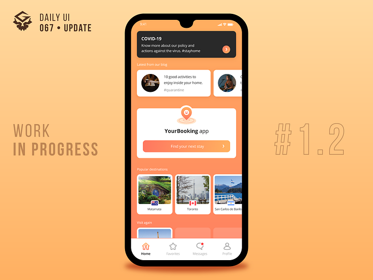
Hotel Booking #1.2 | #dailyui 067 [UPDATE]
Hi there folks!
After receiving some comments, I decided to redesign this home screen.
So, in the previous layout I noticed a great emphasis on the "Articles" carousel and ok, they can be valid content to the user, but working with the assumption that the greatest interest of this user is to make a reservation, I think the "Articles" were taking up a lot of space/highlight on screen. With that in mind, I adjusted the way elements are displayed and established a "block" organization for them, so each element can be arranged in any order. For this case, I defined the app's main action button (start a booking process) vertically centralized, so regardless of the screen size, the button has the required highlight and the user has quick access to it. I also added more content, like a list of most visited places and a secondary list with places already visited by the user. With this layout, I believe there is a bigger and better opening for displaying content. But of course that, speaking in terms of UX, all of this adjustments are an assumption and validations with target users should be made.
And now I would love to hear from you! Feel free to share your thoughts!

