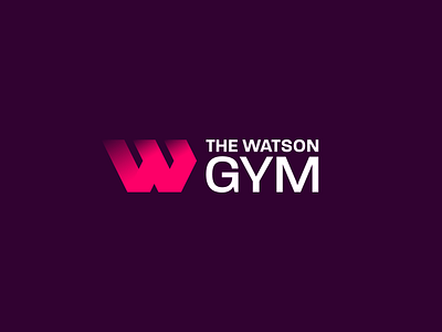
The Watson Gym – Logo & Identity Design
This is a logo design draft that wasn't chosen by the client – a local high end gym. They were looking for an identity that appealed to all genders, and showed strength/quality without being too masculine!
I really like this design's solid lettermark and vibrant colour palette – would have been great to see it implemented.
More by Kane McGuinness View profile
Like
