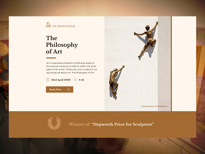
Museum Event - Landing page
A Short landing page can often be a more effective means of driving conversions compared to a longer page, but it has its own challenges.
The Challenge : Using limited content to convince a user to convert.
I have designed an Event page for a museum (I'm assuming that it is a well known museum).So my task of convincing users becomes a tad easier.
Let me break down my design :
- A minimalistic style to reflect the simple yet sophisticated aura of a museum.
- The most important details of the event and the CTA in the hero section.
- The hero shot is directly relevant to the event and gives the user an idea of what to expect.
- Indicating an award won by the museum and that too for "sculpting" which is of relevance to the event.This adds more emphasis to the event and to the artefacts present in it thereby acting as social proof that the event will be worthwhile.
