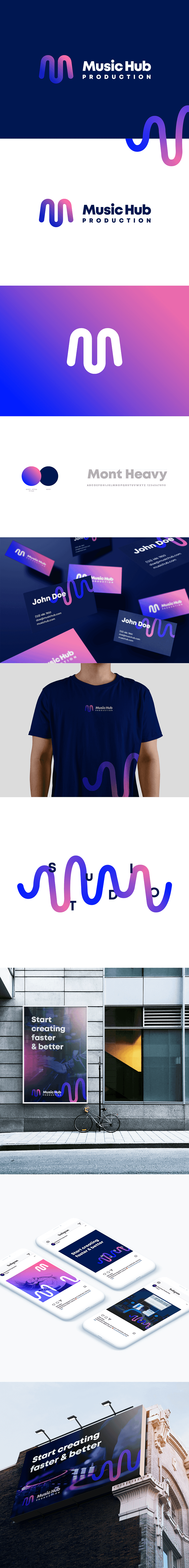
Music Hub Production - logo and branding

Waves, ripples, rich and bold colors – all that can be tight to one word: music! 🎧🎤🎹🎸
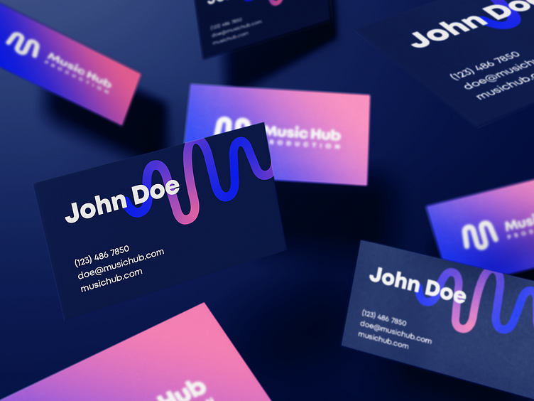
The most important thing was to express music or sound waves throughout the brand and logo. How you can see, the ripples in the brand expressed a playful symbol of M - like music - which is in the first place for the owner Daniel Vrba. This symbol can either be used completely alone or supplied by reliable text.
For underlining the whole design we used fancy colors, which range from pink to blue. They reflect the youth and energy of the company. And it all puts together a timeless brand that will excite you and immediately interest you.
Music Hub Production is a company that focuses primarily on music production, editing, and finalization of recordings.
Like they say “Start creating faster & better” 🤟🏻
Check the full Case Study on Behance here. 🔝