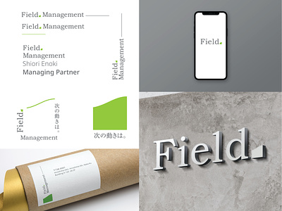
Field Management Identity
Worked with Japanese client Field Mangement to design an identity that reflected their consulting agency dealing with people efficiency to enable individuals within a company to work more as a team. Because Japanese business is deeply rooted in some traditional business practices it was necessary to utilize Old Bookman typeface. The type shares a language that most japanese business owners in Japan can understand. Along with a symbol of a grass pitch that identifies movement not only upward but uneven as to identify some of the challenges that japanese businesses face in bringing people together to work collectively. By maintaining a slightly conservative approach it allows the identity additionally share that they have experience and understand that it is important to be able to bridge an older generation with a youthful generation.
