Winfield Realty Group Logo
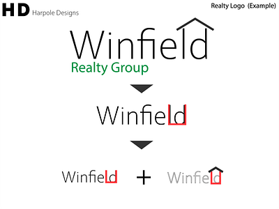
This is a practice draft for a local Realty Group near me. I wanted to make a minimal logo at first glance showed you that this was a realty group. To achieve this I put a roof over the "ld" in "Winfield" to make the basic shape of a house and the "Realty Group" is green to simulate a lush lawn, really driving home the fact that this is a realty logo without having to read any of the logo. The type was a very straight, structural and thin font to really give the feeling of a professional, serious, yet modern feel to the business.
