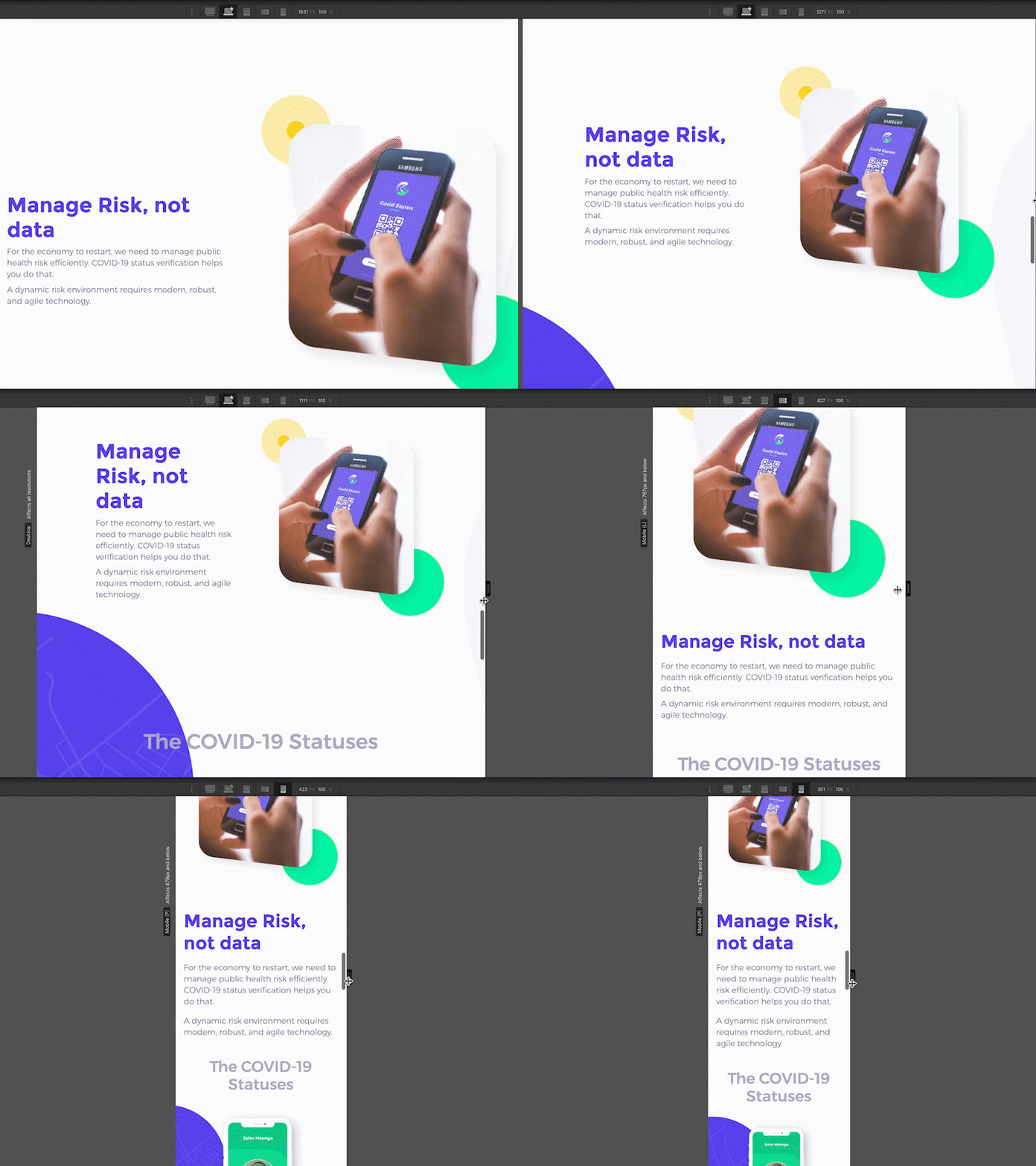
Responsive Design: Coviid Article Section across various screens
I got the chance to work on an urgently needed Covid 19 project at the beginning of the outbreak of the pandemic, and so it was an honour to give my time to this project.
The visual design of this piece was not my own, however, I was tasked with developing the design for web. Here it is in all screen sizes from laptop to mobile (about 1300px to about 400px in width).
This was an easy part of the site - a typical article section with title text, paragraph text, and picture. I used this component about 3 times over on the page.
There is jump cut in my edit, only because as you deal with vastly different screen sizes, the content "jumps" in different places of height quite drastically (as to be expected if you retain all the same font sizes across various screen sizes).
Because I wanted to create this fast and easy, I used webflow, the designers' tool for responsive web development. It was great using a platform like webflow to create an almost pixel-perfect website compared to the Figma design.
