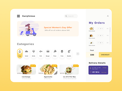
Food Ordering App Exploration UX and UI
Hello Folks,
Extending the exploratory and research phase of truck fly I just took the most popular UI and audited the UX and UI. I found that there's still room for improvement in design that are popular.
Design for reference: https://dribbble.com/shots/6592690-Food-Delivery-Dashboard
From UX perspective the Delivery details should come as a check-once object and hence be displayed after the intent to buy.
Courtesy: @cuberto
Like it to show your love.
---------------------------------------------------------
Thanks for all your support. Connect with me
Behance | Linkedin | Instagram | Blog
Describe me how this looks in your mind. Let’s get started.
More by Himanshu Sharma View profile
Like
