MY LOGO - Emanuele Scapellato
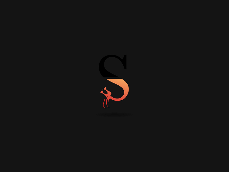
The logo was created using the Adobe Illustrator program and starting from an image of a dragon found on the Internet, and then processed using the dynamic tracing that creates a path. Reworking the layout until it becomes an S in the shape of a dragon using the Baskerville font, which breaks into two parts: one black and the other dark red. The part of red, which is below, is a dragon while the part above black is the continuum of the letter S. The graphic designer has decided to break the logo to create a sort of mirror between the black part and the red part, and to create a more elaborate logo, but also to give an extra meaning to the logo which is to believe that inside every person there is a "dragon" mind the black part is we who see ourselves in that way; the creator gave this meaning because the dragon in Chinese mythology was seen as the bearer of great knowledge and knowledge. The maker decided to use the red color for the dragon because it reminds the color of the dragon's fire, and because red is also a very stimulating color. While black was used because it symbolizes mystery and night. The realization was made by making several tests of the logo until you get to the finished logo. The graphic designer Emanuele has decided to use the figure of a dragon because it is very much reflected in this figure and because the letter S is the initial of his name. For the creation of the business card, the creator decided to use very sharp elements such as triagoli and elaborate rectangles to give a sense of modernity to the whole, using the same colors used in the logo, red and black. The same goes for other jobs such as letterhead and agenda and amglia, which are all inspired by the business card, and to create a sense of equality for all jobs as a coordinated image.
