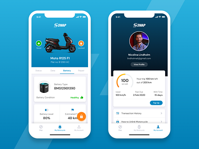
Motorcycle Detail and My Account screens for SWAP
Our biggest challenge while designing the Motorcycle Detail and My Account screens for SWAP was the Information Hierarchy. There was a lot of data required to be shown on these screens, and we had to make it extremely easy for users to interpret that data. Additionally, we had to maintain a modern a clean look for the UI. Do you think we managed to pull it off? Let us know if you have any feedback for improvement.
More by Flolab View profile
Like
