DailyUI #003 - Landing Page
Hey Dribbblers 👋
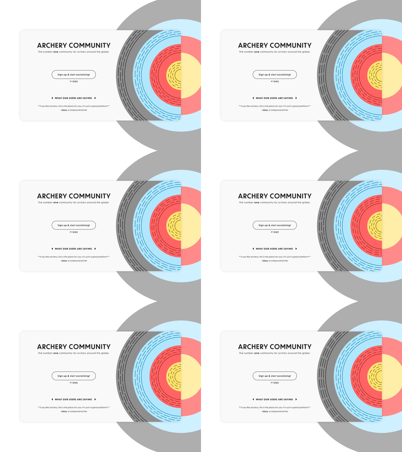
This is my #003 #DailyUI design.
Design Hint 💻 - What's the main focus? Is it for a book, an album, a mobile app, a product? Consider important landing page elements (call-to-actions, clarity, etc.)
The Idea 💡 - The idea for today’s UI design is a landing page for a theoretical web-based archery community app. The design would be simple yet elegant to show off the main elements of the page. The design would have a direct colour palette comparison to my #001 UI design I did for a signup screen here - https://dribbble.com/shots/11941967-DailyUI-001-Sign-Up.
Final Thoughts 🧠 - With the work I have got done today, I'm pretty chuffed! This is the first time I have used Adobe After Effects for animating UI elements. Although the animation is quite subtle (intended), I think it really does spruce up the design and the GIF I have made shows off a better vision of what I'm trying to put across. I had a few problems in Photoshop creating the GIF but I got there eventually! Overall it's been a pretty good day.
Press "L" if you ❤️ my work!
I welcome any feedback! 😄
Lastly, share the love by pressing the share button if you really like what you see! 👍
- Elliot
