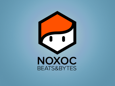
noxoc blog logo v2
I flipped the head since THAT is actually how i wear my hair. Also gives me that nice upwards wave.
I agreed with the feedback which stated that the eyes were too long. Made them a bit smaller and rounded them to give a friendlier feel to them - though square eyes would support the idea of a nerd. Not sure on that yet.
Also I like it much more without the banner.
More by Nils Riedemann View profile
Like

