Dark mode for dashboard
⬛️Dark interfaces have become incredibly popular recently. It's been a while such an option appeared in MacOS, Apple iOS and Android, as well as in many other applications and platforms. Why has this trend become popular?
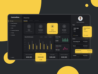
🌚 In some contexts, dark mode may be useful. For example, in the dark, it is more convenient for the eyes. The dark background is less sharp than the bright white screen. A darker interface also saves battery power. Dark mode allows you to highlight content, while the surrounding UI takes second place. A particularly dark UI raises the priority of color elements and graphs in dashboards. Moreover, people who have “certain types of visual impairment” (for example, cataracts) are reported to prefer it over the light UI since it's much easier for them to deal with such an interface.
☕️Create a dark mode for the product or not, you need to decide based on the objectives of the interface. We can add on our own that usually it takes about 20-25% of the time from the creation of the main design.
👀 Make sure to subscribe to our social media:
Instagram | Behance | LinkedIn
🖤 Press "L" and share your opinion in the comments sections on what you think about dark modes in the interface. And if you need to develop it for your product, then drop us a line at hello@equal.design