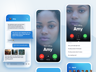
Signal Messenger Calling Options
Show us some ❤️ by pressing “L”
Another part of our Signal Messenger redesign exercise, this time with some concepts around the calls.
During one of our book research / internal hackathons we decided to take a look on how it could be "modernized" and this is the result.
The idea behind it was to merge the current main color scheme, but with a more vibrant twist and with a very big effort on readability - this is why the messages fonts are that big - that puts messages front and center.
Thanks! Let me know what you think.
Designed in Sketch.
Enjoy! 🏄🏻♂️
=============================
👨🏽💻👩🏻💻 We’re available for design and coding projects!
Drop us a line at hello@hype4.com www.hype4.com
Or get our book at
www.designingui.com
More by Squareblack Studio View profile
Like
