Loyalty program website
I was the UX/UI Designer leading this project. I designed the website for the loyalty program www.ripleypuntos.com.pe due to the need to have a digital presence.
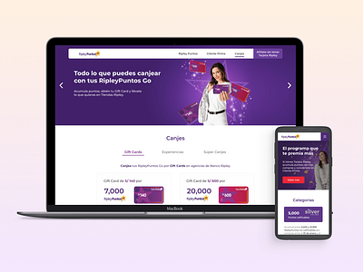
Desktop prototype:
Mobile prototype:
To design this page, I first collected all the information about the program, how it worked and also data they had about the customers' perceptions.
I organized the content to create the web’s architecture and structure. I had interviews with users, from which I got relevant information that they needed to see on the website. Then, I did a card sorting with stakeholders and the team, also taking into account the responses of the clients.
Going to the ideation stage, I used Lean UX to a certain degree to obtain hypotheses that would help me to structure the web.
After doing some sketches on paper, I designed wireframes of the homepage, desktop and mobile. Then I started with the hi-fi prototype design. For this stage I wanted constant feedback, so I did small usability testings according to how I was progressing.
When I had most of the prototype, I needed to validate some points, and I did several tests with users. One of the most important points that the testing revealed was the understanding of Gift Cards. Based on the design of these Cards used a while ago, their value was misunderstood. Changing just a small detail, validated by the tests, made it well understood.
Finally, with a few iterations, the website was launched into production.
