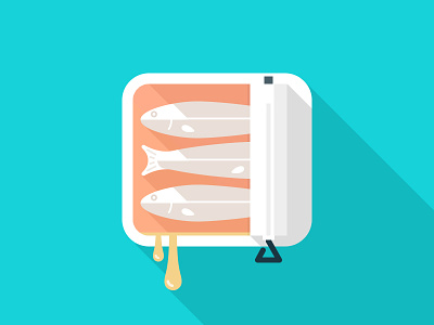
App Icon, Flat
Having some fun with an app icon idea. I think the oil looks better in the @2x view (though it likely wouldn't make it into a final version: too long/weird?)
Finally broke down and used a long shadow. Well, bound to happen sometime, I suppose...
:)
More by AG Fabrega View profile
Like
