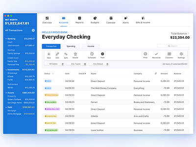
Quicken Mac App - Concept Design
Product UI design styles evolve and spread at a rapid pace. We want to delight new users right when they launch Quicken with a more modern interface.
The current user interface of Quicken Mac has been around for a few years and offers both a sidebar nav for accounts, and a tabbed header nav bar for all other major feature areas. We wanted to touch up and improve layouts in our data-heavy application.
I with two other product designers at Quicken Inc, participated in a 2 day "Quick hacks 1.0" Hackathon organized by the company.
Comment down below what you think of this approach. Also slide right to see what the current Quicken Mac looks like.
More by Quicken View profile
Like

