BYOL Website Challenge
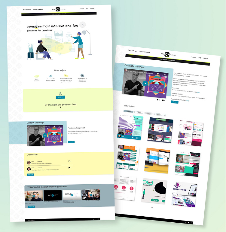
The second challenge of Daniel Scott's series - designing part of the website. I added "discussion" and "inspirational videos" sections to make it more interactive and engaging and help our persona feel "at home".
I included a search bar in the submissions section to find friends' submissions, for example. Removed the "most appreciated" section in the filter as it might create a feeling of competition, anger, etc. I left enough white space between the different submissions to let them "breathe"; made hover option on each for the same reason.
The colours are fresh, calm and inspiring and create a good contrast with the logo, which I also turned around. It creates better harmony this way and is a bit more legible. The heading font imitates rougher handwriting, which links to the creativity and individuality in the website.
