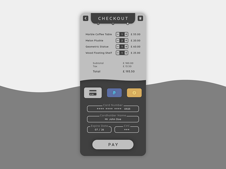
DailyUI #002 - Credit Card Checkout
Hey again Dribbblers 👋
This is my #002 #DailyUI design.
Design Hint 💻 - Design a credit card checkout form or page. Don't forget the important elements such as the numbers, dates, security numbers, etc.
The Idea 💡 - The idea for today’s UI design is a credit card checkout screen for a theoretical high-end mobile app marketplace on Android and iOS. The design would follow a modern, sophisticated but easy to understand nature. The colour palette would also need reflect the high-end aesthetic.
Final Thoughts 🧠 - I'm proud of what I have accomplished today! I've surprised myself of what I had got done too. From wireframing to prototyping to editing, I've enjoyed the process yet again. I think my final design followed what I had set out to do, with the colour palette changing throughout development to fit the aesthetic better but also for UX and legibility reasons, too. I had also tested it out too, changing the size of buttons to fit a better user experience. Overall, I have had fun today and I really like my final outcome.
Hope you enjoy my work ❤️ - press "L" to leave a like!
Feedback 😄 - I welcome any feedback! The comments are open.
Lastly, share the love by pressing the share button if you really like what you see! 👍
- Elliot
