Bring Your Own Laptop Logo Challenge
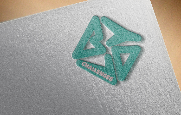
The first challenge of Daniel Scott's series - designing the logo for the "brand". Since the letters are four, I immediately had the image in my mind to compose them in a square/ rhomboid shape with them taking relatively the same amount of space.
After many attempts to make them legible, I arrived at a pleasant outcome that is compact and could be repeated to create a pattern. It eases the initial geometric shape with the rounded corners. It suggests a circular movement (your eye reading it) and a 3D feel with the round shapes and shadows.
The colour I chose for this first version is Dan's main colour choice for his websites so far and also my favourite colour. I believe it works well for the friendly, creative website we are building.