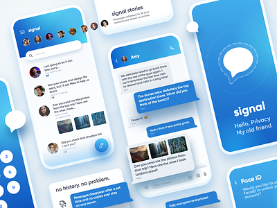
Signal Messenger App Redesign
Show us some ️️❤️ by pressing “L” 🙏
Hey everyone!
We're huge fans of the Signal Messenger app due to it's awesome privacy features. But to be honest, the app looks a bit "oldschool".
So during one of our book research / internal hackathons we decided to take a look on how it could be "modernized" and this is the result.
The idea behind it was to merge the current main color scheme, but with a more vibrant twist and with a very big effort on readability - this is why the messages fonts are that big - that puts messages front and center.
And of course "Stories" could serve as group chats, or chats aimed at "all your friends" like little surveys, questions and so on.
Thanks! Let me know what you think.
Designed in Sketch.
Enjoy! 🏄🏻♂️
=============================
👨🏽💻👩🏻💻 We’re available for new design and coding projects!
Drop us a line at hello@hype4.com www.hype4.com
