The Futur Academy
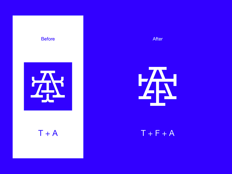
Hey everyone! I decided to create a light redesign of The Futur Academy logo. The main reason is because the letter F is not readable in their current logo, even though Futur serves as the main word. In the “after” version, all 3 letters can be seen. Another reason, is because I wanted to make it more minimalistic and modern, so that the logo would fit their current style. The original logo seems a bit separated in its style from the graphics they use on their website and YouTube channel. Let me know what you guys think, Cheers!
Follow us on Behance | Instagram | YouTube More about us on unfold.co
