WhatsApp Concept Design


Since we are in lock-down, why not use this time to create some fun and exciting concept designs?
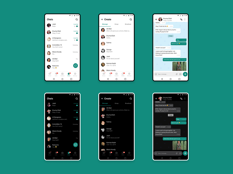
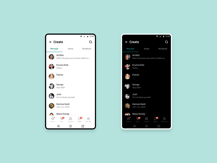
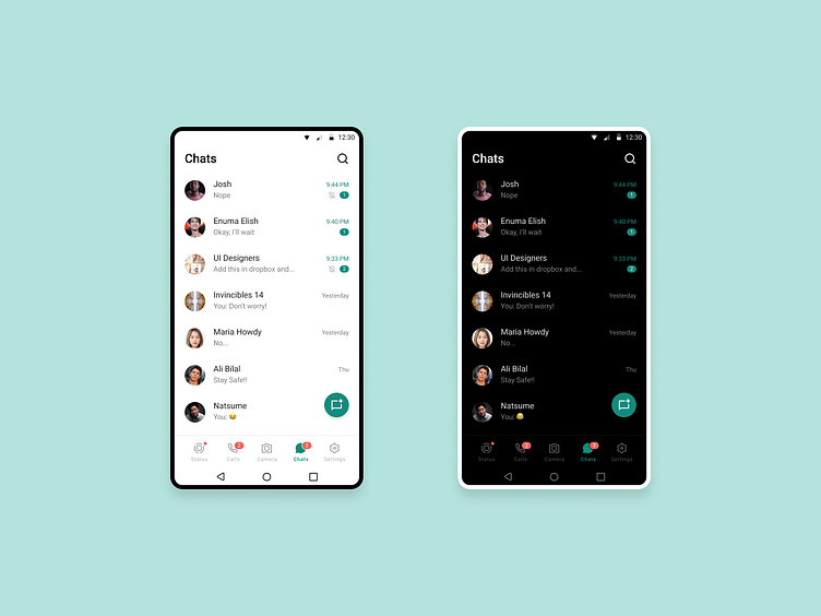
It somewhat bothers me that WhatsApp uses Tabs instead of a bottom navbar to navigate in its Android app. I guess they are following the Android Guidelines so it makes sense. Furthermore, people are probably used to this in Android so changing the UI might be a bad idea at this point. And if it ain't broke, don't fix it! :)
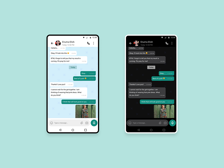
I also didn't like the dark mode in Conversation Screen because of transparent chat bubbles. The text is a bit harder to read. It's okay but as a user I don't feel at home. May be because I am so used to Light theme?
But this doesn't stop me from creating a concept design because this kind of work allows us designers to unleash our creativity without any or probably the least restriction. I tried using a bottom navbar (found in iOS) and added some personal touch as well. Feel free to let me know your feedback on this one.
Cheers and Stay Safe!! :)
Since we are in lock-down, why not use this time to create some fun and exciting concept designs?
It somewhat bothers me that WhatsApp uses Tabs instead of a bottom navbar to navigate in its Android app. I guess they are following the Android Guidelines so it makes sense. Furthermore, people are probably used to this in Android so changing the UI might be a bad idea at this point. And if it ain't broke, don't fix it! :)
I also didn't like the dark mode in Conversation Screen because of transparent chat bubbles. The text is a bit harder to read. It's okay but as a user I don't feel at home. May be because I am so used to Light theme?
But this doesn't stop me from creating a concept design because this kind of work allows us designers to unleash our creativity without any or probably the least restriction. I tried using a bottom navbar (found in iOS) and added some personal touch as well. Feel free to let me know your feedback on this one.
Cheers and Stay Safe!! :)
