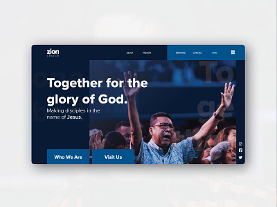
Zion Church Website Design
Hey Everyone! 👋
I recently designed an image-based website for a contemporary church. The interface is mainly developed with a card style of design for greater ease of use and compelling aesthetics.
I was inspired to design based on a mainly blue color scheme and sans serif fonts, and ample use of white space for contrast.
Let me know what you think in the comments!
🔥Take a closer look at the live site today!
https://zionchurch.webflow.io/
Appreciate the ♥️ and follows.
**************************
Motion Design: AE
UI/UX: Illustrator
Development: Webflow
More by Kenrison Balootje View profile
Like
