Lulu Bakery Brand Identity

The goal of this project was to create a simple yet cherryful visual to represent the brand. The identity was created around a mix of flavor and color, where the first one is personified by the cherry and the second one is used as a brand tool kit (illustration styles, color pallet and typefaces).
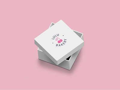
The color pink has been used to show love & sweetness as pink happens to represent sugar and spice and everything nice. The result is a very delicious identity where cherry represents the flavor of these marvelous cakes. .
It’s safe to say that our branding for Lulu was a cherry on top experience for us! 😉
