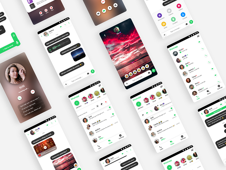
Whatsapp Redesign (Concept UI)
Hey creative people !
I have created a few concept ui screens for ‘WhatsApp’ using Adobe Xd. I chose to attempt to redesign this app as it is one of the most popular chatting app globally and is well adopted by users ranging from children to the elderly, which made it an extremely challenging task to take up.
--------------------------------------------------------------------
▪️ I tried to retain the basic functionality and gave a few subtle UXUI changes like adding swipe gestures to toggle between options and quick actions to make the experience more intuitive.
▪️ As ‘WhatsApp’ is widely used and and loved for its simplicity and intuitiveness, thus while proposing this concept I kept the users in mind and made sure that their mental model is not hampered by unnecessary additions in the experience.
▪️ While redesigning this app, I considered several key factors like keeping the user experience of the WhatsApp users at the forefront of the design process and understanding their needs and preferences to ensure an intuitive and seamless interface.
▪️ I analysed the existing UXUI and identified pain points via a secondary research by referencing user comments on the Android and iOS app stores regarding the areas that could be improved. After this, I employed the industry best practices for design in order to formulate a concept that would address the usability issues and enhance the overall user experience. Simplicity and clarity were the vital elements in the redesign process. I realised that the UI should be visually appealing yet minimalistic, allowing users to easily navigate through different features and perform tasks effortlessly.
▪️ It was important to strike a balance between providing necessary functionality and avoiding clutter that could overwhelm users. Another aspect to consider was consistency and recall value. The redesigned UI had to align with WhatsApp's brand identity and maintain a cohesive look and feel across different screens and interactions in order to create familiarity and a sense of continuity for users, making it easier for them to engage with the app.
▪️ Additionally, I incorporated modern design trends by viewing similar chatting apps and keeping up with emerging technologies that could enhance the overall appeal and relevance of the app and potentially improve communication and user engagement.
--------------------------------------------------------------------
Do check out my other work & let me know how y'all found this one ! 😄✌❤
