Hilda Hollands Branding III
Hilda Hollands
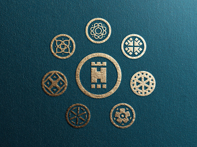
A visual identity for Hilda Hollands International Treasury of Explorers, the branding has been designed to include multiple dynamic logos to represent different parts of the museum. These can be interchanged depending on use with an overarching colour palette as well as individual swatches.
The look has been kept modern and contemporary with a nod to the past and the exhibits that are within the museum walls. It was important to create a logo that could be used at various sizes including digital applications for the museums app; which allows users to discover more about the pieces.
Logos have been created using a grid to create a consistent and uniformed look as well as allow for future designs that may come with expansion in the museum. Branding, stationary and pattern applications can be seen below and provide a range of flexible uses for the museum to use.
You can find me by visiting:
📩 jgunnsdesign@gmail.com
🌐 www.jackgunns.com
@gunns_designs
Thanks!
