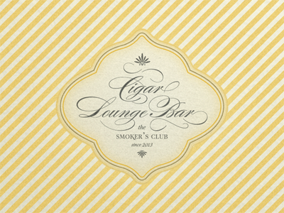
Cigar Lounge Sign ...
… I posted this rebound because of its totally different look and feel, inspired by the yellow of »COHIBA« cigar boxes and tubes. This shot, as well as the one before, is the result of my preferred pastime: »Playin’ with Type«.
… once more I had to recognize that arranging digital type in a proper and balanced way may sometimes be a tougher job than hand lettering. Digital script faces, especially »rich« faces with a plenty of alternate characters and swashes, are a real challenge. Composing a balanced, »eye candy« lettering with those script faces means a repeated nudge to the left, to the right, up and down, change of alternate characters, etc. … You have nearly no chance to modify or »tweak« single characters (their descenders and ascenders) without destroying proportion and »harmony«.
My insight (platitude): The result of hand lettering is mostly the result you planed to have, because down to the last detail, you have it firmly under control. The result of lettering with digital type is always a compromise, no matter how much effort you put into composing and arranging.
A higher resolution of this shot you may find here: 800 x 600
The typefaces I used for this »lettering« are: Alejandro Paul’s (SUDTIPOS) outstandingly and stunningly beautiful »rich« script face: Burgues Script paired with Rui Abreu’s (FOUNTAIN) elegant, stylish flared serif face: Aria Pro … both worth each single cent you spend for the license!!!

