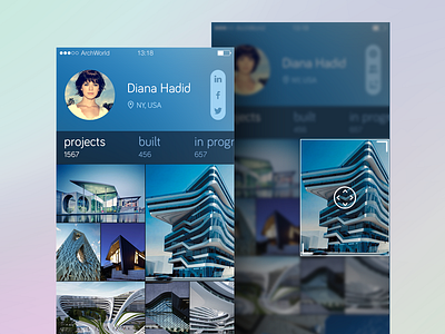
User profile + editing mode experiment
I'm working now on some social network experiment for architects where they can showcase their projects and communicate with each other. The main idea was to create a grid of photos that users could resize by themselves and show big previews of the most important projects, as well as small previews of something ordinary.
The first screen is a User Profile screen where you can swipe left on the stats bar and view filtered projects: all projects, already built or in progress.
The second screen is editing mode of My Profile screen which you can see after tap&hold on a particular preview of your work. Now you can scale and move this preview wherever you want. Tap outside the preview cancels the action.
Interested in hearing your thoughts guys.
Don't forget to check the realpixels of these screens!
EDITED: Freebie's here >>>
Cheers!
----------------------------
