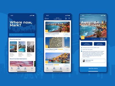
Booking.com app redesign
No matter how much I would love to travel and visit new places, I am not able to understand why Booking.com, which is a website with enormous possibilities, has such a big disorder in its operation and presentation of content.
So in my free time, I decided to take a look at their mobile application, examine what is wrong and design a completely new one - which not only fulfills its task but at the same time is accessible and legible to the user.
Take a flight:
http://artmantyk.com/bookingapp/
More by Artur Mantyk View profile
Like
