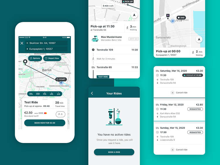
Passenger App Redesign
Our white-label passenger app has been redesigned from the ground up. We started with improving visual styles, including fonts, colors and sizes of the elements. By now, we have our brand-new pre-booking functionality with the active rides view and in-app pick-up and drop-off notifications, improved the riding experience with multiple stops visible on the map, and updated our illustration style, both generic and brand-specific. More is in the works.
More by door2door View profile
Like
