Before & After - Redesigning the Main Score Card - Smart.Reviews


Redesigning the Main Score Card! Today we will walk you through our process of working and all the challenges that we've come across. ⚡
_
About the project: Smart.Reviews
_
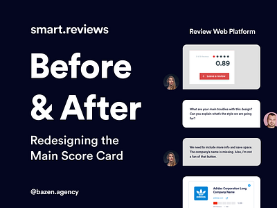
The first thing that we had to do is to prioritize elements and decide which ones are the most important. The main score needed to be large, striking and bold, while marketing and review score had to be smaller. When it comes to saving space, we have decided to remove button for website link, and just place it right below company name, so that the user can click on it right away.
_
Our main challenge while designing the Main Score Card was finding the right layout which will allow us to use bunch of important information, yet maintain the clean look. We wanted to make it more compact, but to avoid messy and crowded appeal. Also, we had to find the right shades for main score, make that green more greener!
_
Which version do you like the most? Share it with us in the comments and explain why! ❤