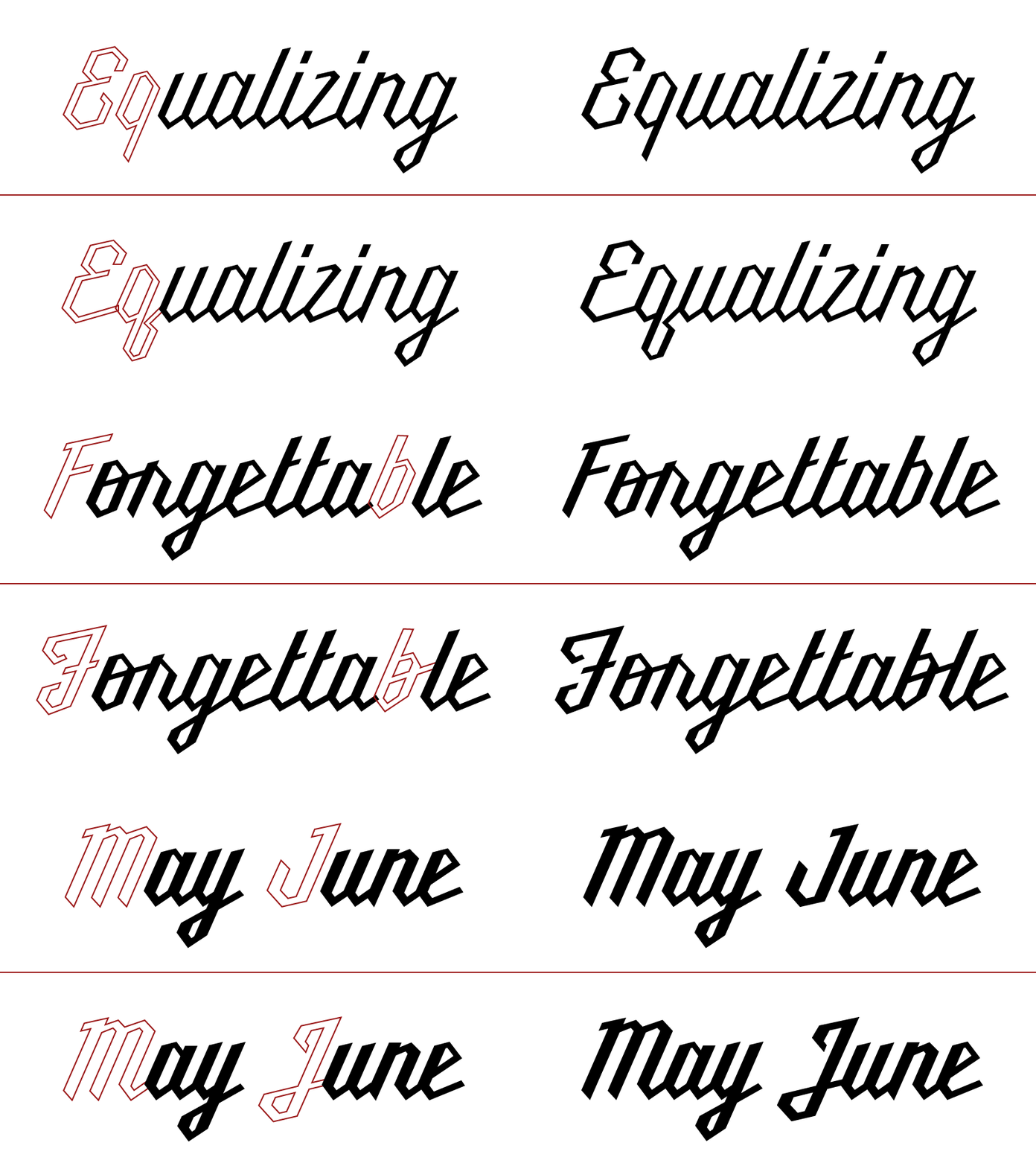
Millie V5.0 [GIF]
I designed Millie when I was still experimenting with the nuances of type design. The short of it being that most things were spaced using kerning pairs, the weights were pseudo interpolated using offset paths, and the most of the drawings were made with little respect for the true nature of the genre it was based on (script, that is).
Over the last couple months, in my free time, I've been cleaning her up for a rerelease. SO. This is what the Light, Regular, and Medium weights now look like. The top half is the standard set, and the bottom half is with the stylistic alternates. Are the stylistic alternates just better? Should I scrap the old stuff?
More by Kyle Wayne Benson View profile
Like
