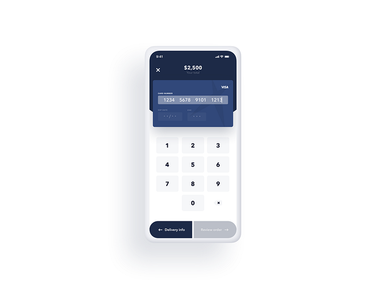
UI 002 - Checkout
Here is #002 of the UI Challenge.
For this design, having the text fields overlayed on the credit card allows the user to stay focused on the task by visually showing them context to their decision making.
Hope ya dig! 🤙🏻
More by Ryan Thies View profile
Like
