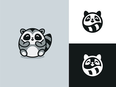
Fat Raccoon Rebranding
Back then in 2016, I created the Fat Raccoon logo for Checkly (logo on the left). Their company is growing and ended up in need of refreshed brand design in 2020. They need a smaller, simpler version of the logo that can be visible in smaller proportions and use one color only. They're happy with the final result. What do you guys think?
More by Alfrey Davilla | vaneltia View profile
Like

