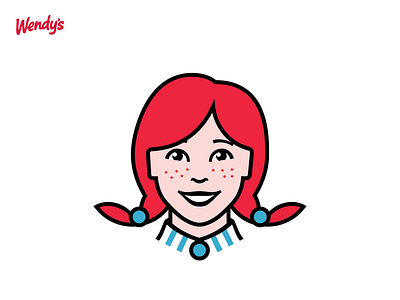
Wendy's Logo Redesign Concept
Old or new? | Wendy's logo redesign concept
I'll be the first to say there's actually nothing wrong with the existing Wendy's logo, I think it's charming and effective. This is the reason I wanted to try it, to see if I could retain the sweet glitter in the eye of the original logo but take a more modern approach.
Boy was that a task, I'm not highly accustomed to mascot logos and there's so much nuance to maintaining likeness and personality while stripping back detail, I also only gave myself an afternoon to complete it. I had doubts initially, but ultimately I'm happy with how it came out. The shimmer in the eye remains and I am pleased about it :)
I find pushing myself out of my comfort zone like this I learn so much more rapidly.
When I posted to Instagram my awesome audience pointed out the 'MOM' in the collar of the original, which I hadn't included in my redesign initially. I decided redo that area to pay homage to that with the stripes in the collar before posting here. It's not obvious, but neither is it in the original, and I prefer not to have sharp lines pointing towards the neck.


