Tweetbot iOS7 - Messages
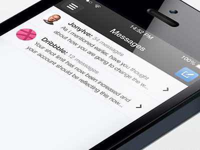
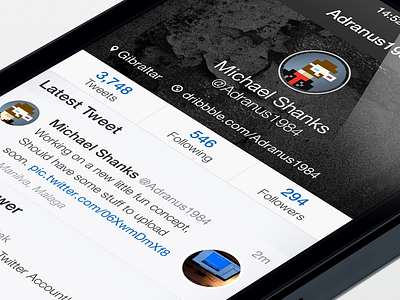
next shot for my Tweetbot iOS7 redesign
one of the things that i never understood about the current messages within Tweetbot was the message counter. it was in the far right corner and it pushed down the arrow indicator, comparing it to the visual crispness and quality of the rest of the app it seemed out of place.
i wanted to make it a little more streamlined, within messages we only ever see the users name so with this extra space it made sense to have the number next to it which allowed the arrow to be centered and give more visual clarity
for your viewing pleasure see the attached real pixels
More by Michael Shanks View profile
Like

