Olson Associates - Re-Brand
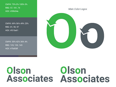


A while back I was asked to do a logo re-brand for a Financial Advisor. This was my take at the logo design. They wanted a new logo that incorporated a similar arrow style to the old one. The old logo was a single circle with a swooshing arrow. I created more of a text logo with a specific circle logo to put in place of the name. They wanted to represent a constant circle of helping their clients from year to year. Things like taxes, financials, retirement, saving for college and more. This was the simple design I came up with, and a new color green and grey.
What do you all think? Thanks!