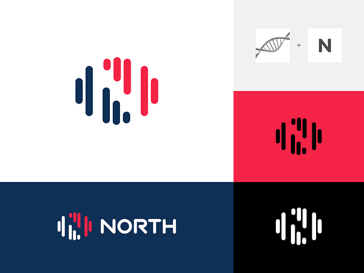
DNA Helix + N
Logo proposal for a private equity firm that focuses on buying digital media brands poised for growth.
Using DNA helix shape as the main inspiration, the symbol uses abstract vertical lines that form a very subtle “N” (in negative space) to give a sense of moving up (growth), improvement, and transition, while the use of negative space reflects creativity and innovation of the company.
Happy to hear your thoughts, thanks!
More by Alfrey Davilla | vaneltia View profile
Like
