User Registration for SWAP app
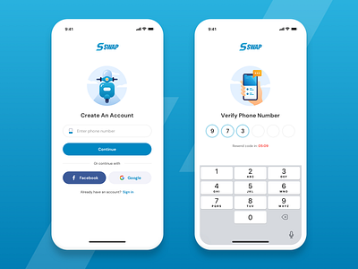
Designing a Sign Up screen may seem easy, but we need mindfully make use of each small UI element. Here's how we designing the Swap registration screens:
- Customizing input fields as per the context of use makes the interface more user friendly.
- Contextualizing the illustrations on each screen makes the input more recognizable
- When we want a user to choose one login channel over the other, we need to make it stand out a bit more over the others, while maintaining the same consistency in the UI style (Facebook vs. Google login)
- Lastly, highlighting the urgency on a timer with a slight change in color.