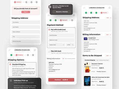
Checkout Flow
Designing for checkout experiences is always challenging—especially for an audience that is mostly used to buy books physically. So we had to be careful we provided the right options—in particular, to be clear with the copy.
To make sure we used the right amount of info, we tested with actual users and decided to use progressive disclosure to break down the flow into smaller steps. This approach worked best because it wasn't overwhelming and gave the impression that it was easy to finish.
More by Shpetim Ujkani View profile
Like


